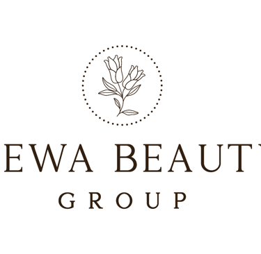
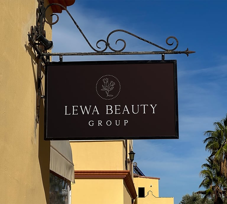
LEWA BEAUTY GROUP
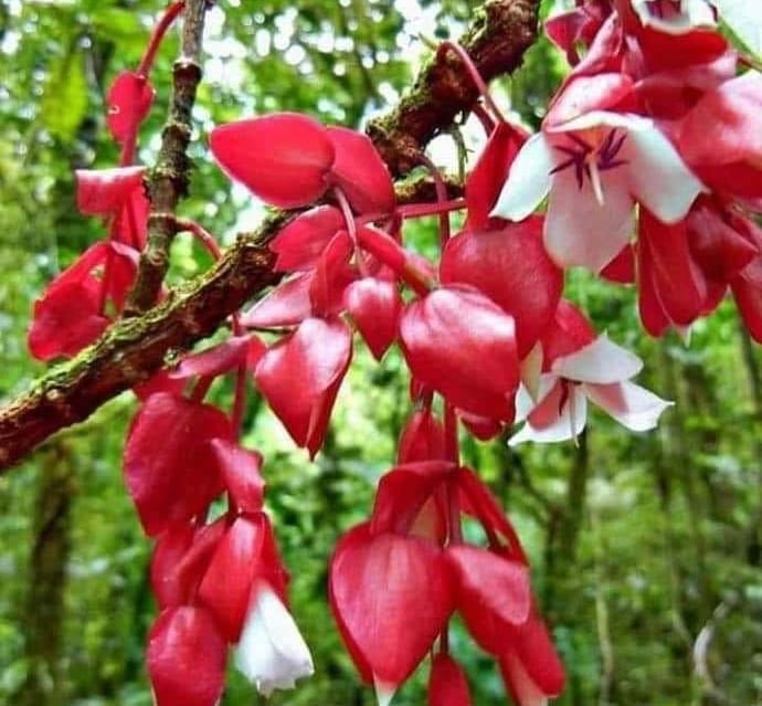
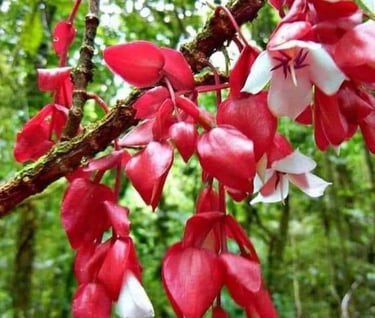
Tagimoucia (pronounced: tah-ngi-mow-thia) is a rare and beautiful flower native to the highlands of Taveuni, Fiji’s “Garden Island.”
Found only on the misty slopes of this remote region, the crimson and white Tagimoucia has become a national symbol of Fiji — celebrated not just for its striking beauty, but for its deep cultural and folkloric significance.
Its name comes from a Fijian legend of love and sorrow, making it as poetic as it is unique.
The tagimoucia flower formed the building block upon which Lewa Beauty was branded
Lewa Beauty Group is a distribution company that supports premium, homegrown Fijian skincare brands which champion sustainability and a strong sense of community. As someone deeply committed to using locally sourced, eco-conscious products herself, the founder envisioned a brand that felt refined, rooted, and responsibly made.
With the brief in hand and the task of building the full visual identity and brand kit, we began by drawing inspiration from the Tagimoucia flower — a symbolic nod to her Fijian heritage — and used it as a conceptual anchor to develop the brand story and aesthetics from that meaningful starting point. From there, the brand evolved into a visual story that strives to balance luxury with authenticity and purpose.


The Logo


Color Palette
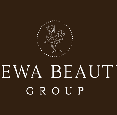
When selecting the color palette, we aimed for something that felt premium yet neutral — elegant without overpowering. As a distributor’s brand, the identity needed to take a respectful step back, allowing the individual skincare brands it represents to shine through with their own visual presence.
The branding had to feel rooted and refined, eco-conscious yet understated, and evoke a strong sense of place — specifically, the Fiji Islands. We drew inspiration from two iconic elements: beach and coconut. This led to a palette of rich coconut browns and soft, earthy creams — tones that feel luxurious, grounded, and quietly tropical.


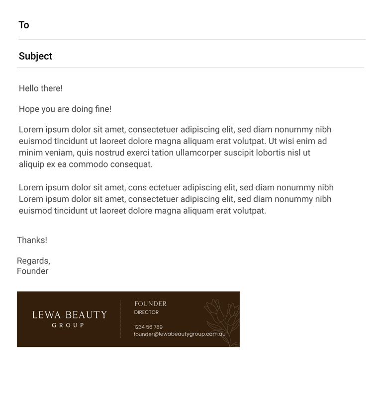
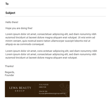
We created a complete brand kit, including business cards and an email signature — all designed to align seamlessly with the brand identity. These elements incorporate the Tagimoucia motif and reflect the founder’s personality, staying true to the brand’s roots while maintaining a polished, cohesive aesthetic.